
Learn a New Language Making Friends
Voxium is a language learning responsive website that motivates users worldwide to interact with native speakers to help improve and to keep each other motivated in the learning process. Voxium aims to speed up the learning process and make it enjoyable.

Project Overview
Background
Globalization has boosted interest in learning new languages due to increased economic opportunities and cultural exchange. Simultaneously, online learning platforms like Duolingo and Rosetta Stone have gained popularity for their accessibility, flexibility, and community-building features. The COVID-19 pandemic further accelerated the shift towards online language learning, making it a prevalent choice for language enthusiasts worldwide.
Problem
Learning a new language online presents challenges such as limited immersion in the language and culture, inadequate speaking practice, the need for high self-motivation and discipline, reduced access to immediate feedback, social isolation, potential technical issues, and the overwhelming abundance of online resources, all of which can hinder the effectiveness and motivation of online language learners. I've observed that many of my acquaintances, including friends, colleagues, and family members, who attempted online language learning tended to abandon their efforts within a few months or struggle to maintain consistent progress.
Role
Duration
8 weeks
Empathizing
Research
Using qualitative research with open-ended questions, I began my research by selecting five people who are either bilingual, language students, or people who drop out learning a new language to go over an interview to understand their pain points, needs, and motivations during the learning process.
By conducting this research, my goal was to:
Once I analyzed the collected data, I discovered that:

“The hardest part of learning online is not being able to interact with people.”
Rob B. - Interview Participant
I also researched and analyzed other language-learning websites and apps to establish what resources are available. After analyzing competitors, I discovered that there’s no all-in-one product in the market that offers all the features to learn a language faster and more entertainingly. Tandem is the only website/app that offers the chat functionality to interact with native speakers by message, voice, or video, but it doesn't offer anything else besides that.
Defining
The Problem
Once I had collected and analyzed data from the research phase, I defined the problem based on the two biggest challenges that participants mentioned during the interviews. From that, I built a few POV statements and narrowed them down to 2 HMWs questions to help me guide on the next steps and to design a solution for the problem.
How Might We Help language learners…
… interact with native speakers?
… stay motivated during the learning process?
Assumptions:
The Persona
Based on the information gathered on the interviews, I built personas that encompassed two types of learners: Jessica and Alex.
Jessica is a busy professional who loves to travel around the world to experience different cultures. She wants to learn another language to enjoy exploring other countries even more.
Alex plans to live in Italy after he gets married to his fiancee. He enjoys his time around her family and friends but wishes to communicate more easily soon.


Ideating
Prioritizing Features
After analyzing the interviews and defining the persona and problem to focus on, my next step was to choose the main features that would be the website launching priority. To begin with, I prioritized the most frequent user’s pain points, so I started with four main features: chat, social media, lessons, and top learners. My intention with the top learner’s feature is to add gamification and make the learning process more entertaining. Lessons and interaction with other learners will help the user to make points. Users can access a leaderboard to see where they stand in the competition. The top learners displayed weekly include friends and non-friends.
Sitemap
Once the features were defined, analyzing competitors helped me organize the sitemap information. I also did a card sorting activity to help organize the information, but it turned out inconclusive and didn’t help answer my questions.

Task Flows
I didn’t just jump from A to B. Considering the key features, sitemap and two of the main user pain points, I created two task flows to help guiding the design of the first screens.

Prototyping
Wireframes
I used the task flows as a base to start working on the wireframes, which helped me ensure every page and detail wasn’t forgotten.


Once I had the mobile screens, I started designing the desktop version. My biggest challenge during this step was to transmute the content from a small screen to a bigger one since I used to design for desktops when I first worked as a web designer in 2009.
Style Guide
Before I jumped to the high-fidelity part, I dedicated time to creating the style guide. Voxium logo represents the different countries and cultures around the world interacting with each other. The blue color was chosen for the interface due to its relaxing and mentally stimulating effects that can boost productivity. Yellow is the accent color to highlight details, symbolizing happiness and encouraging communication. Poppins is the heading font chosen to bring some excitement to the interface. The icons used on the website are from Material Design.

Testing
Usability Test
After finishing the high-fidelity prototype, I recruited 5 participants for a usability test to determine what iterations were necessary to make the overall experience more intuitive and pleasant. I tested three different tasks:
Findings
The testing went very smoothly, and I found no significant issues. The only task that wasn’t 100% successful was the Chat with a native speaker. One participant saw the comment icon on the feed post as a chat icon.
Once the usability test was done, I worked on a few iterations:
Another round of usability testing would be needed to prove that the iteration fixed the problem.


Lessons Learned
Even though social media is widely used, I wrongly assumed that people would recognize and know how to differentiate the chat and the comment icons. Labels alongside icons in UX design enhance accessibility, clarity, consistency, and overall usability. They are vital in making interfaces more user-friendly, especially for a diverse audience with varying abilities and cultural backgrounds. It was great to see that clearly with the usability test.
My biggest challenge with this project was reorganizing the information from mobile to desktop. I'm proud of what I accomplished with this project at this stage in my design journey, with this being my first project as a UX designer.
Selected UX Design Works

Adding a feature to Expedia WebsiteUX/UI Design
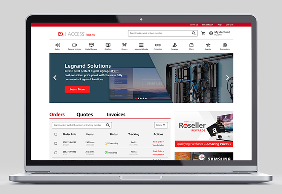
Access Almo Pro AV Ecommerce Portal RedesignUX/UI Design

X Borders AppUX/UI Design
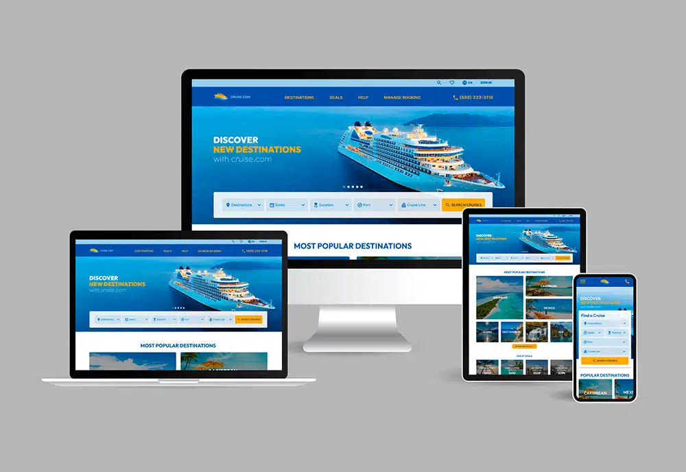
cruise.com Responsive Website RedesignUX/UI Design
Address: 1014 W. 36th Street, Baltimore, MD 21211
Phone: +1 240 883 2123
Email: carolina@maydigitaldesign.com
© May Digital Design 2026