Adding a feature to
Building domain knowledge around interfaces with a lot of choice points and significant complexity.
Designed and prototyped an AI-powered itinerary planning feature for Expedia.

Project Overview
Background
In today's digital age, the world has become more interconnected than ever before, and with that comes the rise of online travel. Now, with just a few clicks, we can explore countless destinations, compare prices, book accommodations, and arrange transportation, all from our homes or while on the go. Online travel has revolutionized how we plan, experience, and share our journeys, opening up a world of possibilities and transforming the travel industry as we know it.
Role
User Experience (UX) Designer
UX Researcher
Information Architecture
User Interface (UI) Designer
Duration
6 weeks
Disclaimer: I do not work for Expedia, and the views in this case study are strictly my own. This case study is an exploratory learning experience.
Problem
Key Human Problems
Planning a trip is not only time-consuming but there is also the need to use multiple platforms to book the entire journey. Users have to spend a significant amount of time researching not only accommodations and flights but also individual activities that fit within the time frame and location of their visit. In addition to searching and consolidating information, users also need to share the itinerary, including all details, with their companions. All of these elements decrease productivity and increase the likelihood of turnover.
"I would like to see recommendations that are catered to my likes, personality, or group dynamic."
Kali D., research participant
"It's hard to keep track of everything using multiple platforms, especially having to share the information with friends."
Dana M., research participant
Key Business Implications
The new feature will offer Expedia a competitive advantage by saving users time and increasing productivity, shareability, user retention, and acquisition. From a revenue perspective, this increases the potential for enhanced partnerships with vendors and an overall boost in sales.
Solution
The itinerary page offers numerous choices, featuring a variety of activities and options for flights, hotels, and more. The information is organized chronologically and vertically to ensure the itinerary is easy to understand, aligning with a conventional calendar-like mental model seen in tools like Google Calendar and Outlook.
A vertical timeline was added to establish unity in the schedule and serve as a guide throughout the itinerary creation process, making it easier for users to understand how one event influences the next. To prevent excessive reading and scrolling, the information is separated by time. A carousel hides additional options within the same category reducing cognitive load. Combining all items (booked and suggested) creates a fluid flow, facilitating better organization and understanding of all the different pieces of the itinerary.
The visual design played a crucial role in differentiating suggested items available for booking. The contrast and colors of the suggested items card help increase the appeal to book an activity. Booked items are distinguished by a green label and a white background, while suggested items feature a light blue background along with a primary button labeled 'Book Now’.

Impact
100% Qualitative Approval Rate
Five participants were tested and all provided qualitative feedback expressing a strong liking for the feature and a desire for it to be implemented. 100% of participants completed the task without error when tasked with booking a variety of activities, flights, and hotels.
Key Takeaways
Introducing a new feature without a competitor to compare with presented several challenges. The biggest was how to orient the user to new functionality with as little cognitive demands as possible. In this case, using a familiar, calendar-like mental model, helped to balance the cognitive load required to utilize the new functionality. This approach also made it easier for users to select items, and understand how one itinerary choice influences a later one, all while gaining a better overview of the entire itinerary. Navigating these different elements and challenges really helped me better understand the details of designing interfaces with lots of choice points and areas of complexity.
Selected UX Design Works

Adding a feature to Expedia WebsiteUX/UI Design
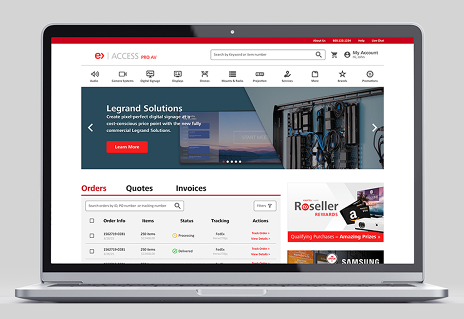
Access Almo Pro AV Ecommerce Portal RedesignUX/UI Design

X Borders AppUX/UI Design
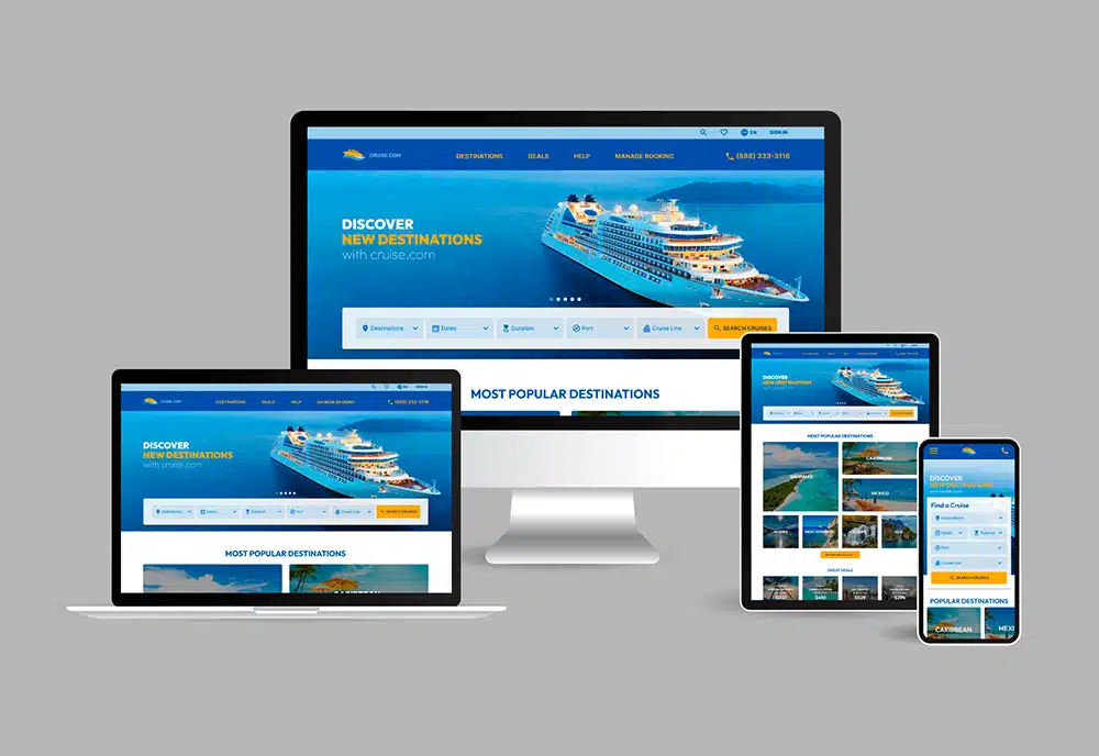
cruise.com Responsive Website RedesignUX/UI Design
Address: 1014 W. 36th Street, Baltimore, MD 21211
Phone: +1 240 883 2123
Email: carolina@maydigitaldesign.com
© May Digital Design 2026