
CRUISE.COM
Responsive Website Redesign
Cruise.com is a travel agency specialized in cruises based in Dania Beach, Florida. The agency has self-proclaimed itself as one of the internet’s largest cruise specialists. They are member of CLIA (Cruise Lines International Association) - the world's largest cruise industry trade association.

Project Overview
Background
Cruise.com, among the largest cruise agencies in the US, has encountered a dip in website sales in recent years. The website's challenges include excessive unorganized information, hindering smooth navigation. Alongside its outdated appearance, this has contributed to a decline in online sales.
Problem
The website's challenges extend beyond the abundance of disorganized information, which complicates navigation. In addition to the outdated appearance, the platform has experienced a noticeable downturn in online sales over the past few years. These issues are not only evident in analytics but have also been validated through insightful discussions with participants who rigorously tested the website.
Role
User Experience (UX) Designer
UX Researcher
Information Architecture
User Interface (UI) Designer
Duration
4 weeks
Disclaimer: I do not work for cruise.com, and the views in this case study are strictly my own. This case study is an exploratory learning experience.
Empathizing
Research
The website cruise.com was created in 2015 and has recently lost online sales. To find out the problem, I invited 5 participants to test the website and determine the main pain points and features they liked. One of the questions that I needed answers to know where I would start ideating was the preferred device used when booking a cruise. Surprisingly, most of the participants use a desktop to book their cruises. They stated that seeing all the details on the desktop is easier than on mobile. The participants also mention destination as one of the most important criteria when booking a cruise. When I questioned how helpful the favorite list was, 3 out of 5 participants thought that the favorite list was helpful and often used to make a decision later.


After inquiring about cruise.com, the participants stated that the website has too much unorganized information. None of the participants was able to book a cruise on cruise.com. They got stuck while selecting the deck and didn’t know how to proceed after that step. Ultimately, they love the comparison feature and the high number of deals that the website has to offer.

Defining
The Problem
The online sales from cruise.com have decreased recently, but that was only part of the problem. Through the research, I found out that participants think that cruise.com looks outdated and has too much unorganized information. After testing the website, I discovered that the biggest problem was the select the deck page – one of the many pages the user must go through during the booking process. The page has too much information, and it’s unclear where the user should click to proceed.
The Persona
As a result of the interviews and prior research, I’ve identified two personas that helped me guide the design choices. Cruisers are couples and families that love to travel in comfort and to have the opportunity to see different destinations in one trip. Their age varies, as they can be younger in their 20s or older in their 70s. Basically, users can be anybody older than 21yo, as most cruise lines don’t book cruises for minors due to the alcohol restriction.
Damon (from the persona) loves to plan vacations with his fiancée. He likes to go on a cruise because of the carefree experience. He loves visiting different destinations while enjoying activities and food every time he cruises.
On the other hand, Tina is a busy mother of 3 who travels with her big family every year. She loves to go on cruises with her family, where everybody can get together and do a lot of different activities without worrying about spending extra money.

Ideating
Prioritizing Features
After completing and analyzing the research, I created a list of MVP features I would consider adding to cruise.com. While researching competitors’ websites, I noticed repeated features that I thought it important to add to cruise.com. Since the project's primary goal was to increase sales conversion, I considered tools to help the booking process and the most important and most used features like comparison features, favorite lists, itinerary maps, and a gallery with ship and room images.
Sitemap
Once I analyzed competitors’ websites, cruise.com, and the features I would prioritize on the project, I started putting together the new cruise.com sitemap. It helped me organize the information and better view the whole new structure for the website.

Task Flows
With the main features and the sitemap in mind, I chose to focus on the 4 most important features that would help the users in the booking process: search, favorite, compare and book a cruise. I drew each task flow to help me guide through the design of the pages.

Prototyping
Low and Mid Fidelity Wireframes
I learned the best way to display page organization by exploring ideas through sketching. My goal was to ensure that the pages were clearly organized, with ample negative space and predictable design patterns to guide the user to a better experience while booking a cruise.
I used the task flows as a base to start working on the wireframes, which helped me ensure every page and detail wasn’t forgotten. I sketched the main pages and followed with mid-fidelity for all the other pages. The desktop version was the priority to start sketching, as Google Analytics showed, and users confirmed that 85% of the traffic is through a desktop device when booking a cruise.
Hold the arrow and move to the right/left to view low/mid-fidelity screens.


Testing
Usability Test Findings
I didn’t want to go too far ahead and find out that something I designed wasn’t working, so I decided to do the usability test right after the mid-fidelity prototype. That way, I would know earlier if I needed to fix anything. The testing went very smoothly, and I didn't find any issues. The only detail that I needed to be worried about when designing the high-fidelity prototype was the comparison button. My idea of the comparison button was that the Add to Compare button would switch to Compare Now button, and the user would need to click it once more in any of the Compare Now buttons to see the comparison page. Because this is just a prototype, I couldn’t test the functionality as I wanted. I would have to repeat the usability test one more time once I had the website live.
- HIGH FIDELITY PROTOTYPE -


Desktop vs Mobile
As mentioned, I started ideating the desktop version first, as 85% of the traffic comes from a desktop device when booking a cruise.
I made no major changes from the new desktop to the new mobile version. Some information had to be divided into more pages in the mobile version because of the small real state. The compare feature isn’t available on the mobile version for the same reason.
The high-fidelity desktop version below shows the changes made to the product page I designed due to research and user testing. The information was organized clearly, and the booking process was broken into separate steps to ensure the user had easy access to the information needed.
Lessons Learned
1 - Page organization is essential when building a website with so much information to display and so many steps to go through as is required to book a cruise.
2 – One of the biggest challenges I faced was the time constraint. Besides that, I had to design the progress tracker displayed on the booking pages a few times before finding a clear and easy-to-understand version. Guiding users through a complex process by making it easy and intuitive is key to helping increase conversion rates. I still think that the progress tracker on the high-fidelity prototype can be improved.
3 – It's impossible to test some functionalities in a usability test. Once the website is live, another round of usability testing will be needed to prove that the compare button works well.
Selected UX Design Works

Adding a feature to Expedia WebsiteUX/UI Design
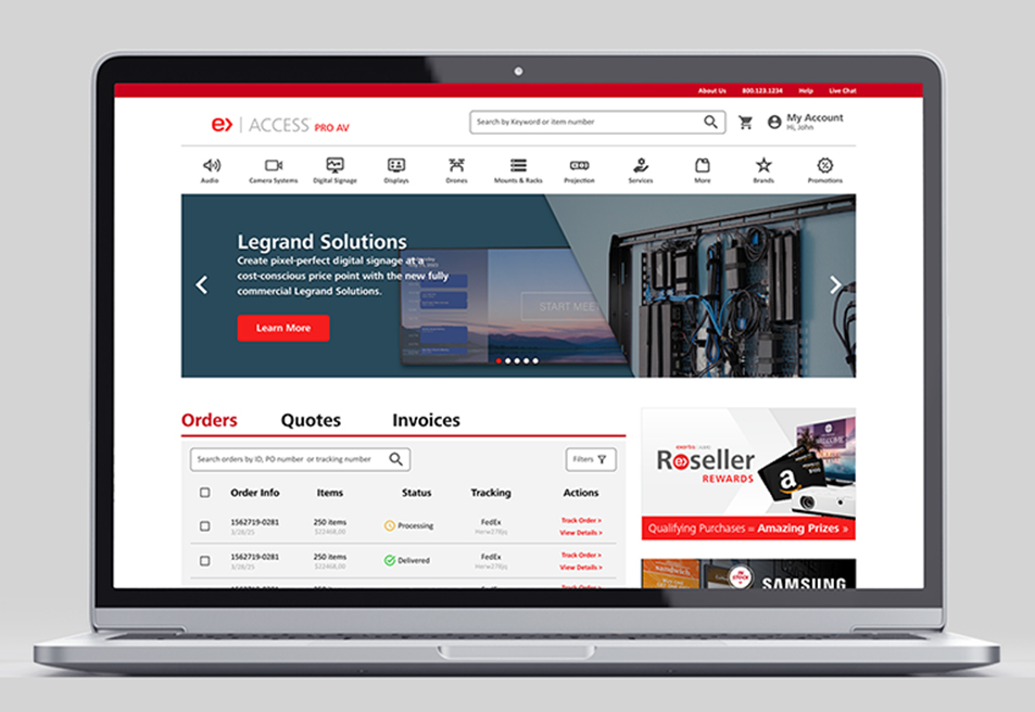
Access Almo Pro AV Ecommerce Portal RedesignUX/UI Design

X Borders AppUX/UI Design
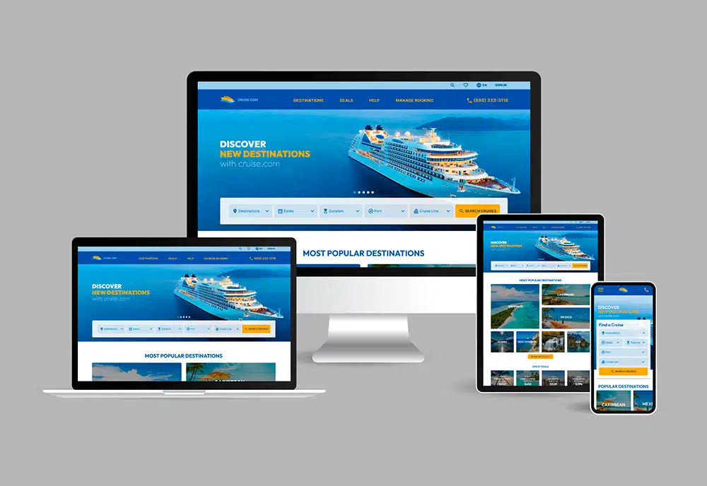
cruise.com Responsive Website RedesignUX/UI Design
Address: 1014 W. 36th Street, Baltimore, MD 21211
Phone: +1 240 883 2123
Email: carolina@maydigitaldesign.com
© May Digital Design 2026