Discover. Connect. Belong.
Cross borders and make friendships with X Borders.
"X Borders" is an app to help people from different countries living in the US connect and become friends. The app is a place to facilitate cross-cultural exchange and foster relationships among people from different backgrounds and nationalities, assisting immigrants to feel like they are home.

Project Overview
Background
The US is home to more immigrants than any other country – more than 45 million people, according to the latest Census estimates. There are different reasons why people move to the US from different parts of the world: some are seeking economic opportunities, others are fleeing violence or climate disasters. Excluding tourism and unauthorized arrivals, most people arriving in the US are temporary workers, students, or coming to be with their families, according to usafacts.org.
Problem
Living abroad is a big challenge, especially when the immigrant moves without their families to a country that's not their land of birth. There are no friends or family to support when it's needed. “Loneliness is a growing social problem that increases the risk of medical conditions among adults in the United States. As a result of the stress associated with immigration and acculturation, immigrants are at a higher risk of experiencing depressive symptoms than their native-born counterparts” (Wilmoth & Chen, 2003).
Role
User Experience (UX) Designer
UX Researcher
Information Architecture
Branding
Content Design
User Interface (UI) Designer
Duration
4 weeks
Empathizing
Research
To find out the challenges, motivations, pain points, and needs immigrants face when living abroad; I begin my research by selecting 5 immigrants to go over an interview.
Once I analyzed the collected data, I discovered that 100% of the interviewees stated it's a big challenge to make friends in the US, especially with Americans. All participants mentioned that culture and language barriers are the biggest struggles in getting used to living in the US and making new friends. Besides the cultural difference and language barrier, similar interests and age differences were also mentioned as challenges when making new friends. They all agreed that safety and security are among the most important features when using an app to make friends.
"It’s important to anyone to have friends because sometimes they become your family or better support system than your family, especially living abroad."
Thais, research participant
"I feel more comfortable talking with an immigrant rather than an American because I feel like an outsider and immigrants understand each other."
Hugo, research participant
80% of the participants want to make more friends and think of their friends as a support system, almost like a family. They want to connect with people that have the same interests as they have. The interviewees also mentioned that group activities and group chats could help make people interact easier than one-by-one interactions because they would already have a subject in common to talk about it. Still, they wouldn’t pay for a premium version of the app to make friends.
60% of the participants would love to see filters to select their preferences when searching for new friends instead of only being matched by the app. Ultimately, they believe it becomes more challenging to make friends as we age.
I also researched and analyzed other dating apps and social media that help people connect to establish what resources are available. The products I studied were Facebook, MeetUp, Hey! VINA, Bumble BFF, Wink, and Patook. After analyzing competitors, I discovered they all have a chat feature. Most of them have a feature that allows users to create and join groups to share experiences and create events to invite other users. Most analyzed products also have a premium version with some extra features.
Defining
The Problem
Many immigrants face social isolation and struggle to make meaningful connections with locals or other immigrants in their new community, leading to feelings of loneliness and not belonging to that place. Besides needing more social support networks, they face challenges like the language barrier and cultural adjustment. How can we develop an app that effectively connects immigrants with similar interests and backgrounds, facilitating the formation of supportive friendships and fostering a sense of belonging? Addressing these challenges and developing solutions that cater to the unique needs of immigrants can significantly contribute to their successful integration, well-being, and ability to form meaningful connections in their host country.
How Might We...
help immigrants to make friends based on similar interests?
connect immigrants to others around them?
help immigrants to feel safe when making friends online?
Assumption: Creating an app to facilitate immigrants connect and socialize through similar interests by text messages, video calls, and/or voice messages.
The Persona
As a result of the interviews and prior research, I’ve identified two personas that helped me guide the design choices. Their age varies, as they can be young as a newborn or older in their 60s, and there are different reasons why people move to the US from other parts of the world. One of the biggest challenges when using an online app to make friends is to feel safe.
John migrated to the US with his family when he was 12 years old. Now, 10 years later, he feels more comfortable living in the US, but he would like to make friends with the same interests that accept and understand who he is. His biggest challenge is to feel safe in an online environment.
On the other hand, Daniela moved to the US 2 years ago and left her entire family back in Colombia. She is not used to her new life in the US yet as she struggles to find her new circle of friends to enjoy the good times together and support her when difficult times come.


Ideating
Prioritizing Features
After analyzing the interviews and defining the persona and problem to focus on, my next step was to choose the main features that would be the website launching priority. To begin with, I prioritized the most frequent user pain points, so I started with three main features:
Social Support Network Platform: This feature facilitates the connection between immigrants enabling them to seek friendships based on similar interests and connect with people who understand their unique challenges, thus fostering meaningful relationships. By incorporating features like chat, voice, or video calling, the app promotes a virtual space for immigrants to interact, share experiences, and seek advice from others to foster a sense of community and provide emotional support.
Events and Groups: Organizing and promoting in-person events, such as workshops, or community gatherings, help immigrants connect with others with similar backgrounds or interests. These events provide a platform for cross-cultural understanding and integration, allowing immigrants to feel a sense of belonging and build relationships with people who understand their experiences.
Online Safety: One of the biggest challenges that all interviewees mentioned when using an app to make friends online is safety. By including a "Report User" feature, the app empowers its users to flag any inappropriate or abusive behavior they encounter. This promotes a safe and respectful environment within the app, ensuring that immigrants feel protected and can trust the platform. It allows for quick identification and resolution of any issues, preventing potential harm or harassment. The "Verified Profile" feature adds an extra layer of authenticity and credibility to the app's user base. Immigrants may feel more comfortable interacting with individuals who have undergone a verification process, as it confirms their identity and minimizes the risk of encountering scams or catfishing. The verification would be through email, cellphone number, photo ID, and photo verification (asking the user to take a selfie doing a specific pose). Verified profiles increase trust among users, making it easier to establish genuine connections and friendships.
Sitemap
Once I defined the main features, analyzing competitors helped me organize the sitemap information and better view the whole new structure for the app. I created the first version, but once I started working on the task flows and low-fidelity wireframe, I realized that I had much more to add to it and had to make a few iterations to the initial idea to make it more complete and accurate.


Task Flows
Considering the main features, the sitemap, and two main user pain points, I created four task flows to help guide the design of the first screens. I drew each task flow to help me navigate through the design of the pages.
1 – Match, chat, and search for a new friend
2 – Block and Report a User
3 – Join a group and start chatting with people there

Brand and Style Guide
Before starting the wireframe process, I brainstormed various names for the app. I chose X-Borders to develop the logo and style guide. The "X" implies crossing borders, highlighting the app's mission to unite individuals from various countries and cultures in the US. The app is a place to facilitate cross-cultural exchange and foster relationships among people from different backgrounds and nationalities. The colorful X represents the diversity of races, cultures, and countries inside the US.
I chose dark blue for the background interface because of its positive effect. It represents trust, loyalty, and sincerity. The color was also selected as a background color to feel pleasant to the eyes. Yellow is the accent color to highlight details, symbolizing happiness and encouraging communication.

Prototyping
Wireframes
Once I identified the core features and functionalities and mapped out the task flows, I sketched rough ideas on paper. I began with basic layouts of screens, focusing on the key elements and interactions, considering the placement of features, navigation patterns, and content hierarchy.

After evaluating the effectiveness of each design solution in addressing the target users' needs, I seek feedback from potential users in group critics to identify any usability or functionality issues. I refined the sketches based on the input, making necessary adjustments and improvements and creating the mid-fidelity wireframe using a digital tool. Then it was time to start working on the high-fidelity prototype.

High Fidelity Prototype
With the mid-fidelity wireframe in hand, I started adding visual details, such as colors, logo, imagery, and typography, to create the high-fidelity prototype that would simulate the app's interactions and would be used to test the usability of the proposed design. Once again, I had to iterate details/features, such as adding the comment section for the events page, removing the "Interested" button from the Events main page, and changing the layout on the group page because it was lengthy and repetitive with the "Join Now" button, to make the app more user friendly and address the target users' needs.

Testing
Usability Test
I tested the first version of the prototype with five potential users to gather feedback, understand their perspectives, and determine necessary iterations for making the overall experience more intuitive and pleasant. Here are some key takeaways:
The testing went smoothly, and no significant issues were found. One test user commented that the tasks were 'very simple.' All participants completed the four tasks, except for one who didn't finish the task 'change the filters to search for another user.' This participant didn't notice the search button (magnifying glass) on the right side of the top bar for searching different user profiles when on the home page. One possible solution for this issue would be to change the search icon to a filter icon, indicating that users can edit filters when searching for others. Another round of usability testing would be needed to confirm that the iteration resolves the problem.
One participant pointed out that the heart icon (the like button) seemed too romantic, considering users want to make new friends in the app. Another participant mentioned that the 'Report User' button could stand out more on the page.


Lessons Learned
Selected UX Design Works

Adding a feature to Expedia WebsiteUX/UI Design
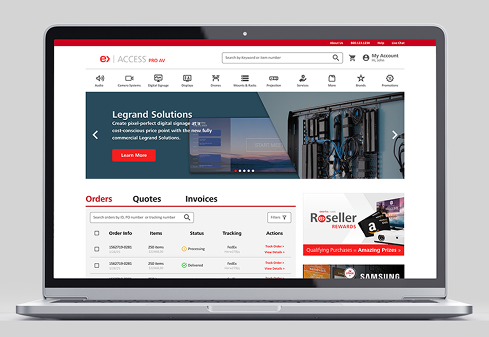
Access Almo Pro AV Ecommerce Portal RedesignUX/UI Design

X Borders AppUX/UI Design
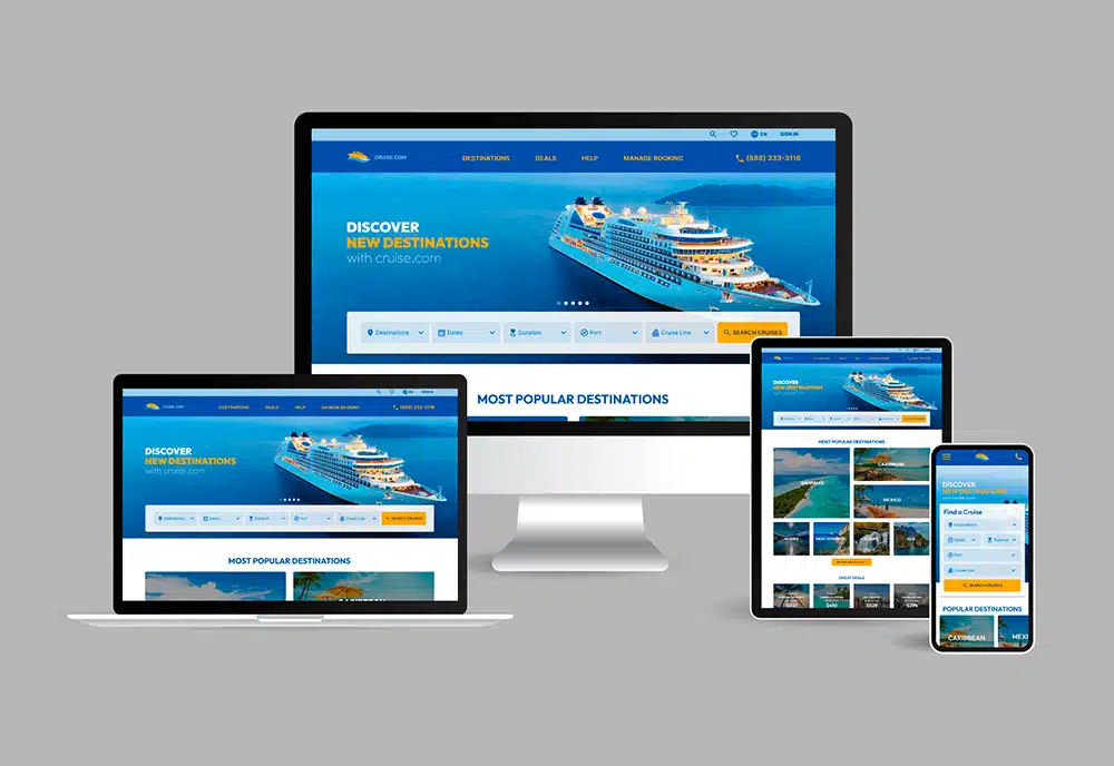
cruise.com Responsive Website RedesignUX/UI Design
Address: 1014 W. 36th Street, Suite 621, Baltimore, MD 21211
Phone: +1 240 883 2123
Email: carolina@maydigitaldesign.com
© May Digital Design 2026