Transforming a Legacy B2B Portal Into a Modern Ecommerce Experience
Project Overview
Background
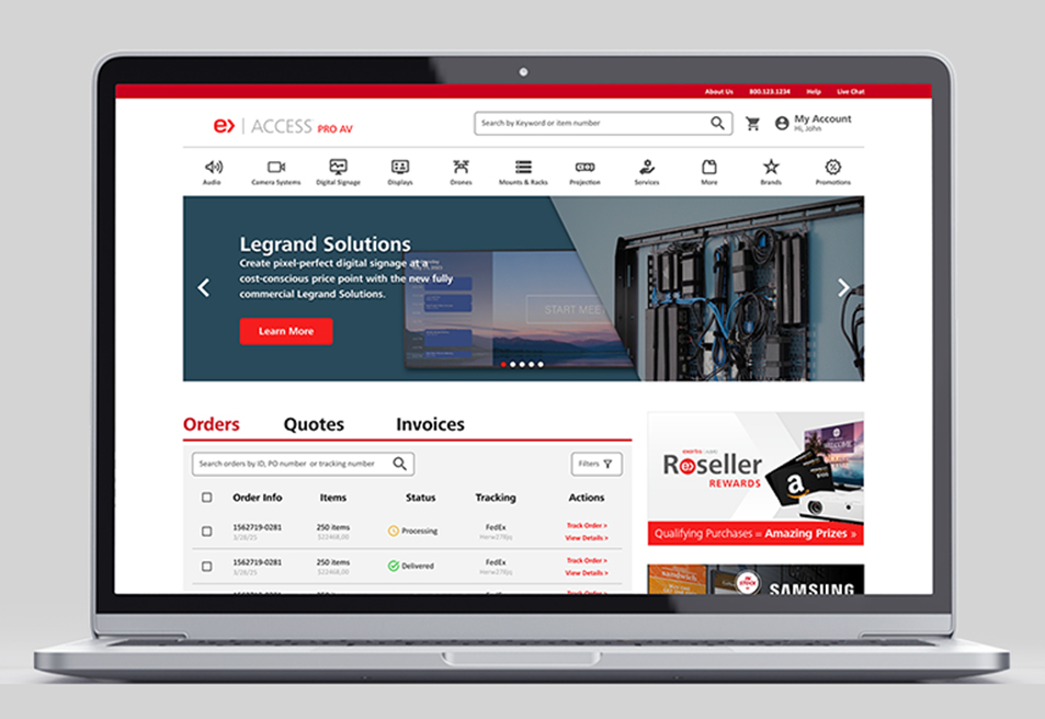
Almo Corporation is one of the largest independent distributors of appliances, consumer electronics, and Pro AV equipment in the U.S. Their Pro AV reseller portal, Access, is a critical platform used daily by integrators, and reseller partners to browse products, build quotes, and manage purchasing workflows.
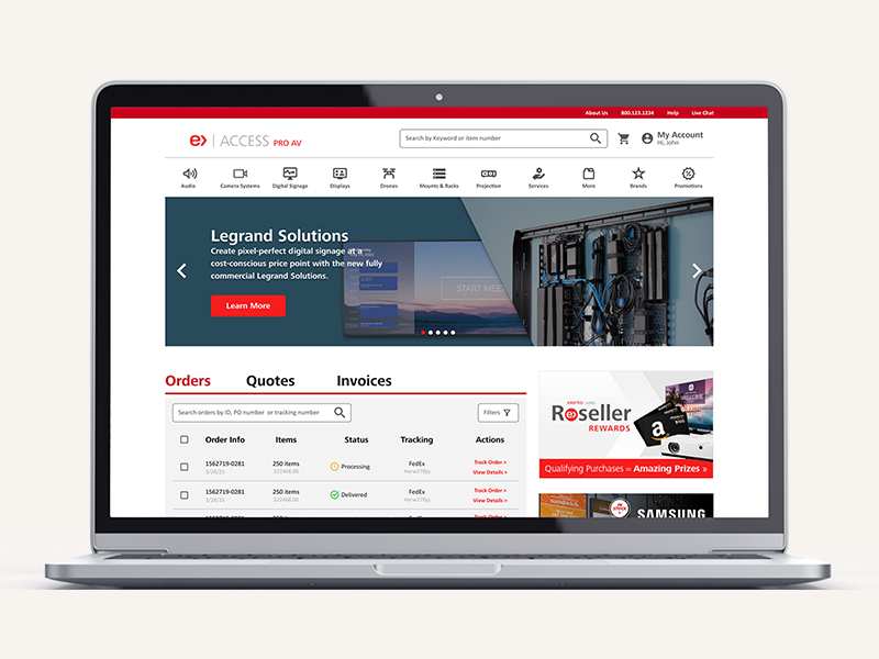
The challenge was clear from the beginning: the existing portal felt outdated, difficult to navigate, and disconnected from the fast paced workflows of its users. Important resources were buried, navigation lacked structure, and many modern ecommerce features users expected simply did not exist.
Role
Duration
8 Weeks
My responsibilities included:
I partnered closely with the Head of UX throughout the project. While the Head of UX led user research and early feature prioritization, my primary focus was to work on the sitemap restructuring, navigation strategy, feature organization, UI design, and wireframes and interface concepts.
Problem
The Challenge
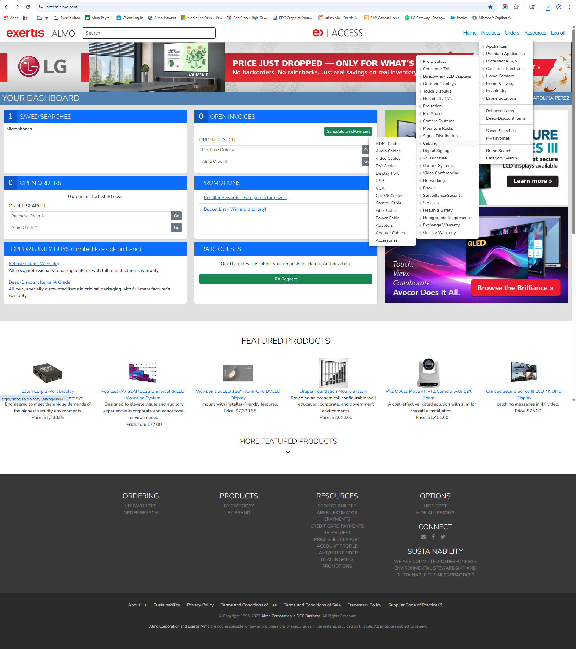
The original Access platform looked and behaved like a website from the 90s: fragmented navigation, unorganized information, and outdated UI patterns. As more tools and resources were added over time, the platform became increasingly difficult to navigate. These issues created friction in common workflows, forcing users to rely heavily on customer support. The portal contained years of legacy content, disconnected workflows, and inconsistent page structures. Users struggled with:
Balancing modernization with familiarity.
The challenge was not just modernizing the UI. It was reorganizing a complex B2B ecosystem without disrupting the workflows users already depended on. Because Access was a long standing platform used daily by existing reseller partners, it was important to improve usability without completely disrupting familiar workflows. The challenge was finding the balance between introducing modern UX patterns while maintaining enough consistency for long time users to adapt comfortably.
Access Portal felt stuck in the 90s.
Key Business Implications
The outdated Access portal created friction at every stage of the reseller journey. Users struggled to find products, access resources, and complete purchasing tasks efficiently due to confusing navigation and limited self service functionality. This poor experience impacted both usability and business performance, reducing product discoverability, increasing support dependency, and creating missed revenue opportunities.
Solution
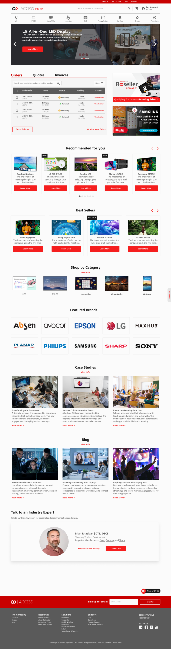
My goal was to create a platform that felt organized, efficient, and built for how resellers actually work. The redesign focused on:
The goal was not simply to redesign the UI. It was to transform Access into a platform users could rely on every day.
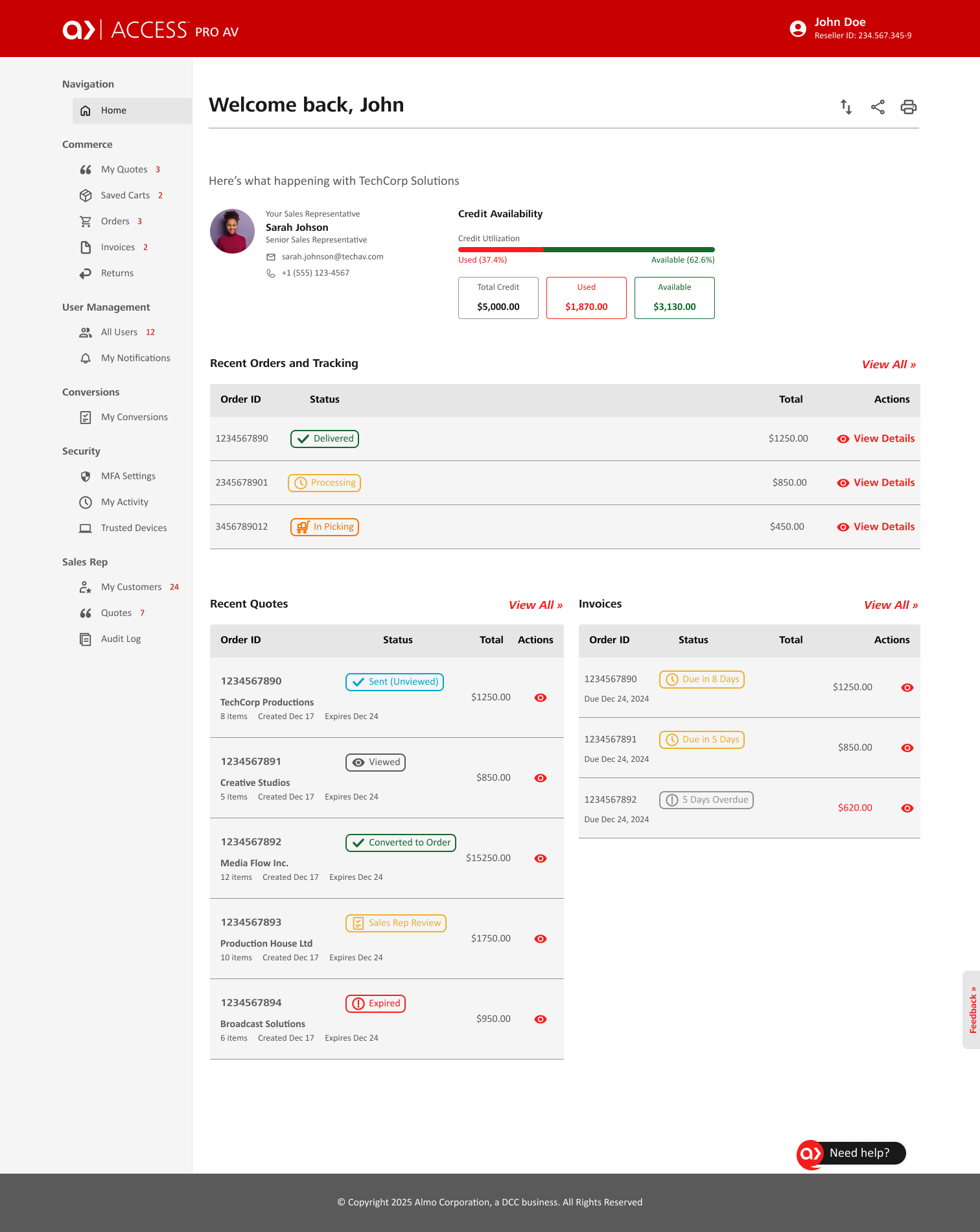
Creating structure from complexity.
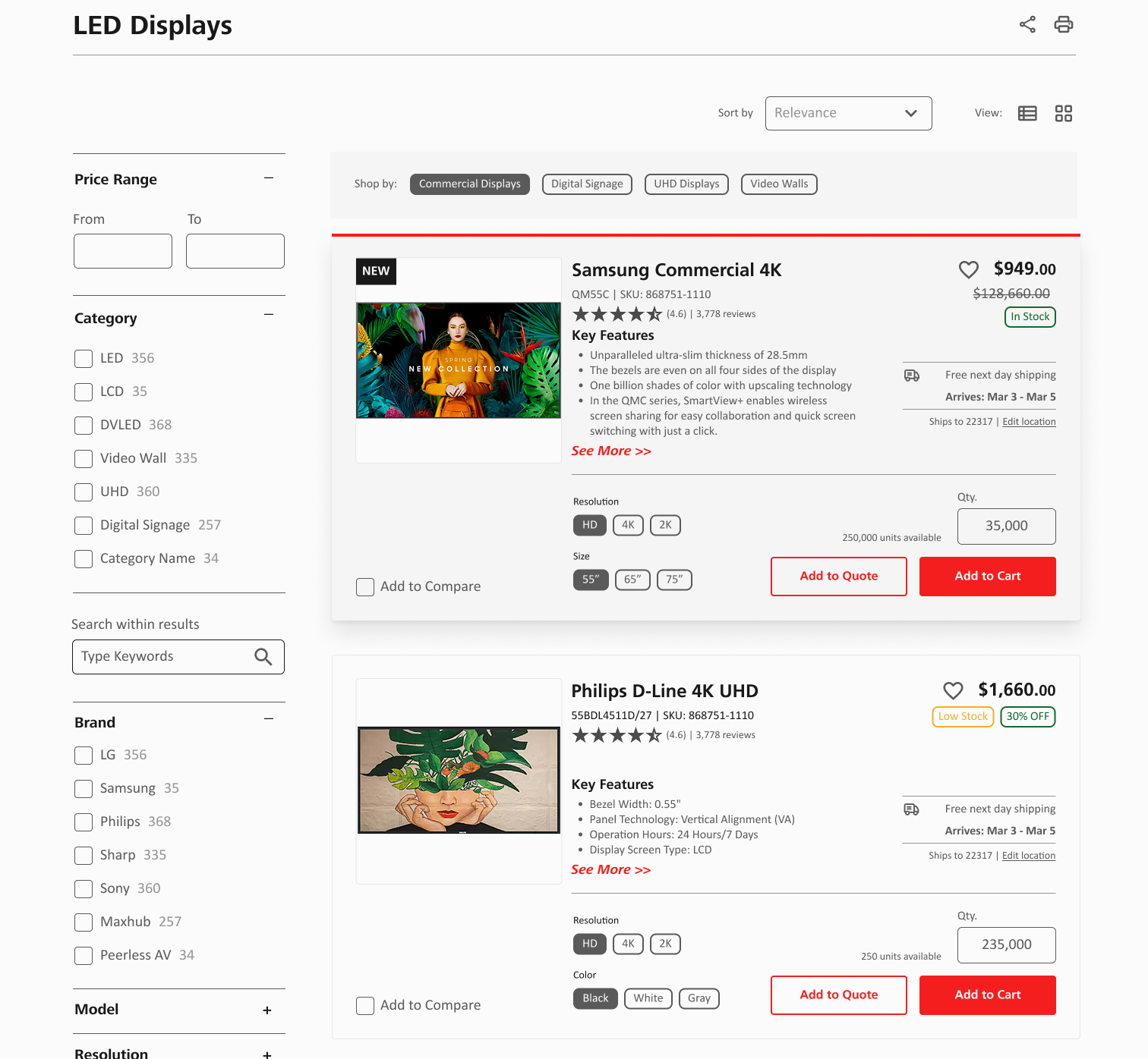
One of the biggest opportunities was reorganizing the platform around how users naturally think and work. I restructured the sitemap and navigation into five core categories:
This helped reduce cognitive overload and created clearer pathways throughout the portal.
Key Improvements
Designing smoother workflows for busy B2B users.
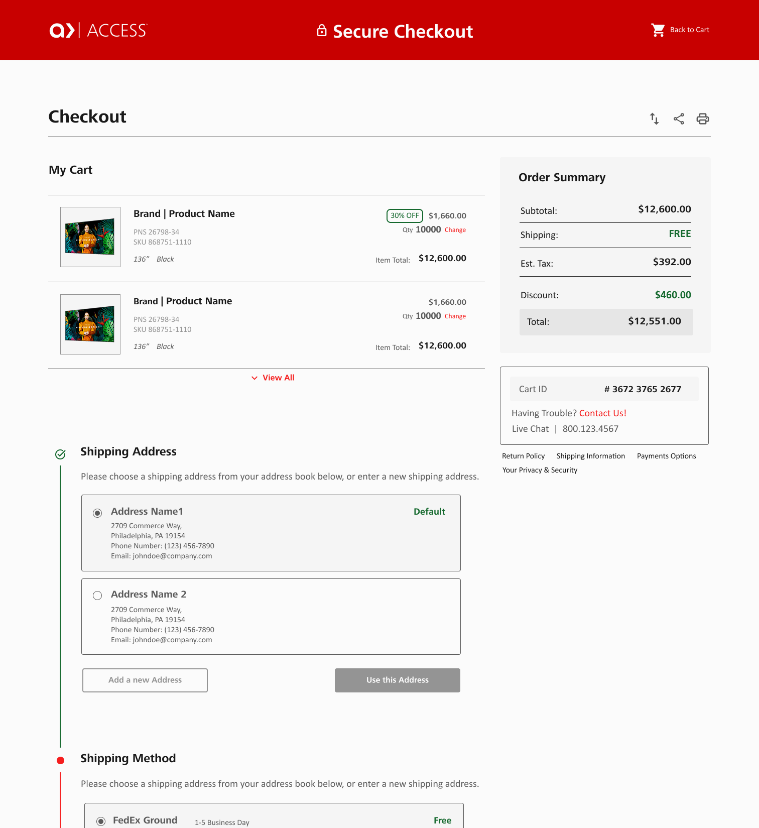
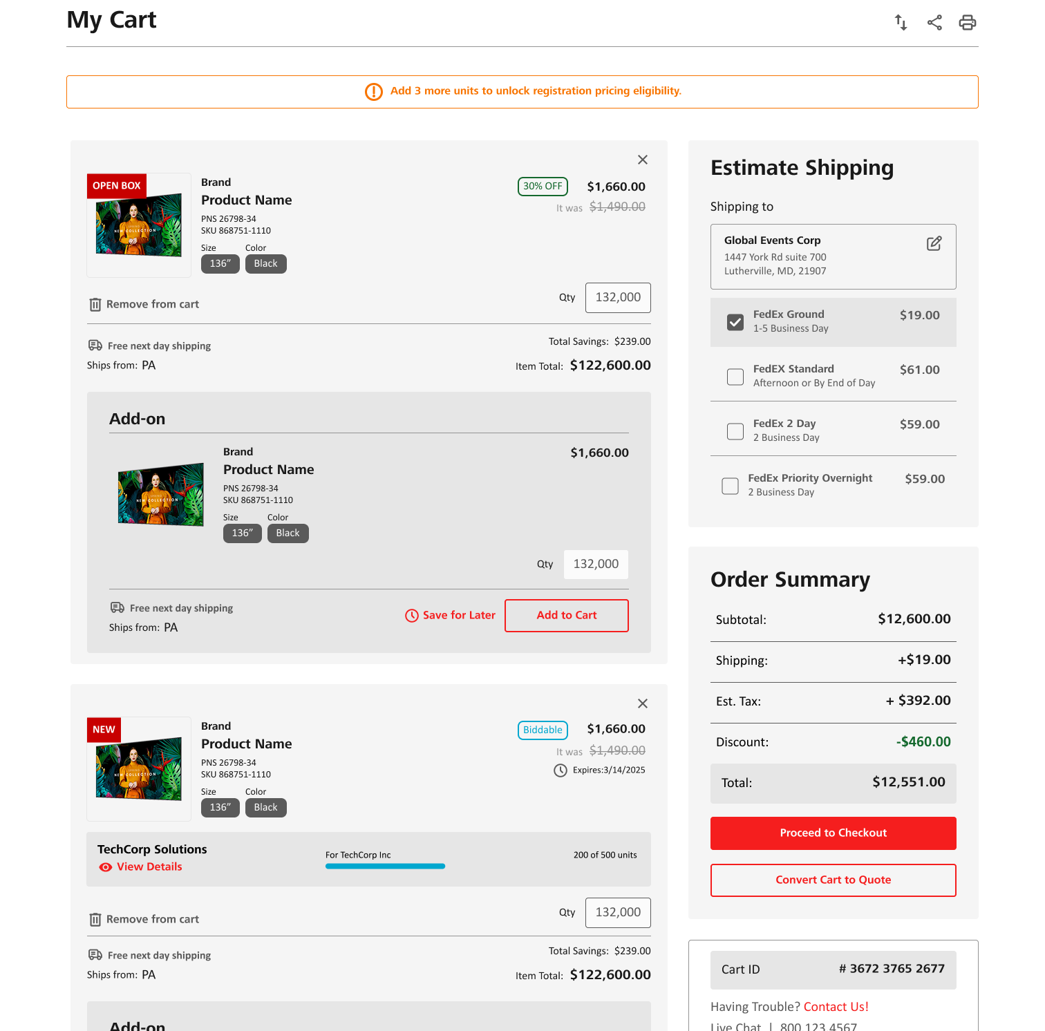
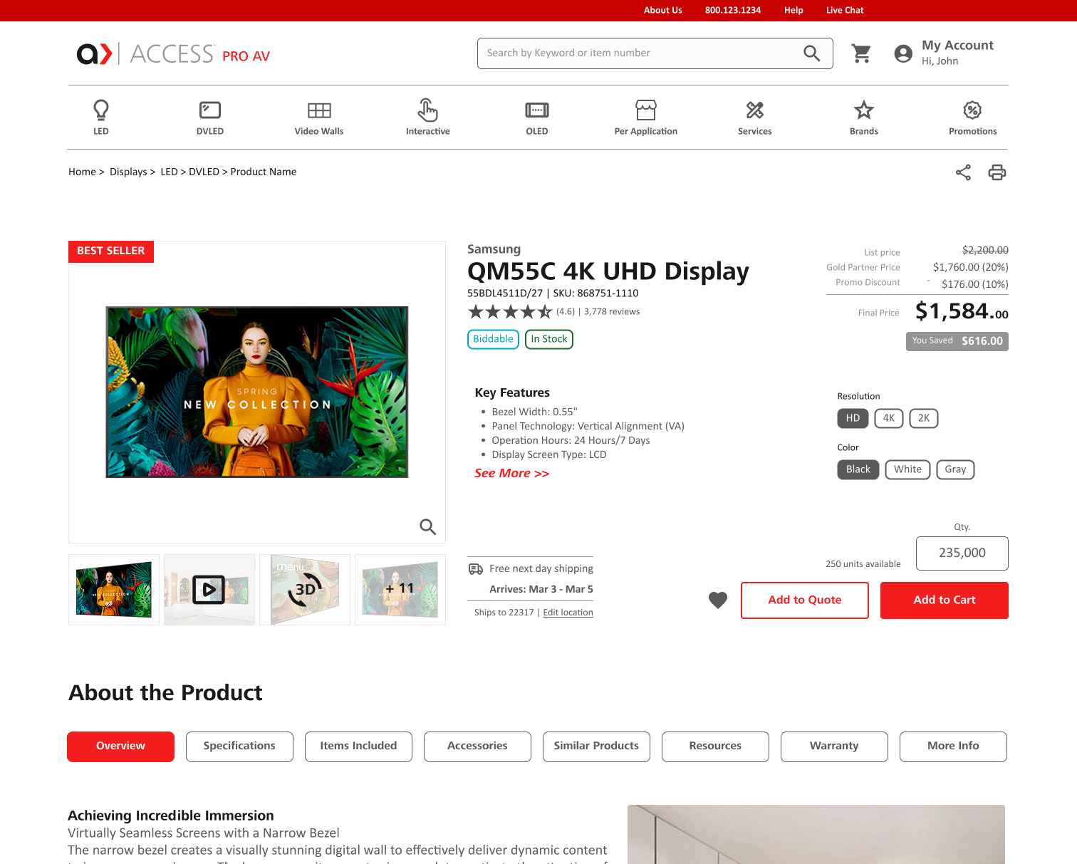
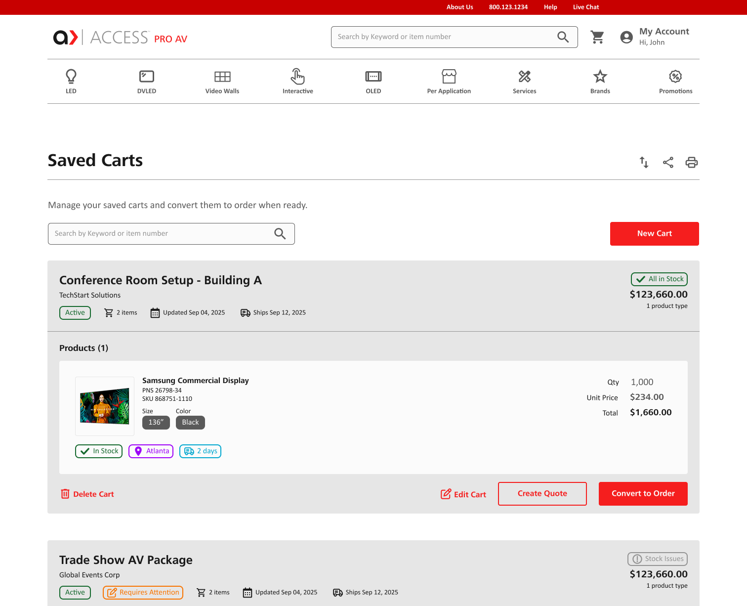
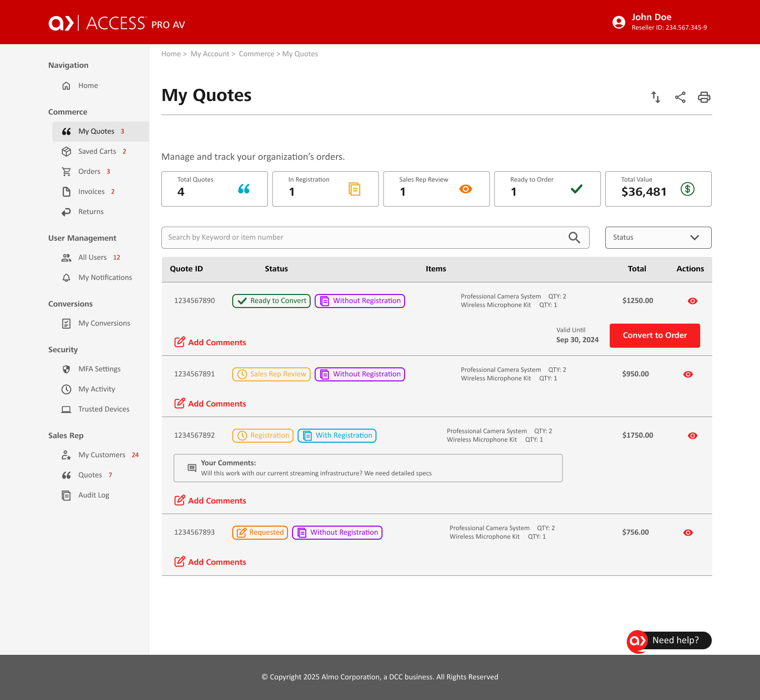
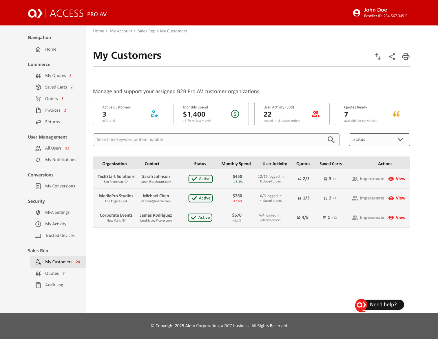
The redesign introduced several new features designed to support real reseller workflows and reduce friction during key tasks. New functionality included:
Biddable product indicators
Saved carts were introduced because reseller purchasing decisions often happen across multiple sessions and may require approvals before checkout. Improved filters helped users navigate large product catalogs more quickly, while live chat provided faster access to support without interrupting workflows.
Modernizing the experience while building trust.
Visually, the original platform felt dense and outdated. The redesign focused on creating a cleaner and more professional interface that better reflected Almo’s scale and expertise. I introduced:
The updated UI helped simplify complex information while making the platform feel more modern, approachable, and trustworthy.
PROBLEM
Confusing navigation
Difficult product discovery
Fragmented support experience
Limited purchasing workflows
Poor visibility of important products
Lack of inventory awareness
SOLUTION
Reorganized information architecture
Improved filters and recommendations
Centralized resource hub + live chat
Add to Quote + Saved Carts
Best sellers + personalized sections
Back in stock notifications
Impact
Designing for measurable improvements.
Although I left the company before usability testing was completed, the redesign was built around clear user and business goals. Success metrics would likely include:
The redesign positioned Access to become a more scalable and user friendly platform that better supports reseller productivity.
Key Takeaways
Designing enterprise systems requires both strategy and restraint. This project reinforced how critical information architecture is within complex B2B ecosystems. It also highlighted the importance of balancing user expectations, business goals, and legacy system constraints.
If I had continued on the project, my next steps would include:
Final Thoughts
This redesign transformed Access from a fragmented legacy portal into a more structured, intuitive, and modern ecommerce experience for reseller partners.
By improving the information architecture, streamlining workflows, and introducing more user centered functionality, the redesign laid the foundation for a more scalable platform designed around how B2B users actually work.
Selected UX Design Works

Adding a feature to Expedia WebsiteUX/UI Design
Access Almo Pro AV Ecommerce Portal RedesignUX/UI Design

X Borders AppUX/UI Design
cruise.com Responsive Website RedesignUX/UI Design
Address: 1014 W. 36th Street, Baltimore, MD 21211
Phone: +1 240 883 2123
Email: carolina@maydigitaldesign.com
© May Digital Design 2026